Experiment 26
This post analyzes urban mobility patterns to identify critical mobility hubs, network resilience, and neighborhood structures within cities by applying centrality algorithms and community detection on graph networks.
Urban Mobility Networks: Uncovering Commuter Patterns in Cities
Cities are defined by movement. Every morning, millions of people leave home to reach work. Every evening, they return. This migration shapes everything: traffic congestion, air quality, real estate values, employment opportunities, and social equity.
Yet despite its importance, we rarely see commuting patterns clearly. We experience them—sitting in traffic, missing a meeting, choosing where to live—but we don’t see them as a system. Where exactly do commuters come from? Which corridors carry the heaviest flows? Which neighborhoods are most dependent on distant employment centers? Which areas could benefit most from local job creation?
These questions matter for city planning, transportation policy, and equity. But answering them requires data: fine-grained observations of where people are and where they’re going, aggregated at a scale that reveals patterns without violating privacy.
That’s where the LYMOB dataset comes in.
The LYMOB Dataset: Aggregated Mobility Traces
The LYMOB (LYsimob Mobility) dataset captures movement patterns derived from mobile device location traces and cellular network data. Instead of tracking individuals, it aggregates patterns at a population level, creating a mathematical portrait of how cities function.
The data represents each city as a 200×200 grid of cells, where each cell is a geographic region. For each cell pair and time period, we know how many people moved from one cell to another, broken down by hour of day and day type (weekday vs. weekend).
What makes this valuable is the granularity: we know not just that people commute, but when they commute (rush hour vs. afternoon), where from and where to, and how many make each trip. For urban scientists, this is like having X-ray vision into the city’s circulatory system.
Building the Commuter Graph: From Raw Movement to Network Structure
Creating a commuter transit network from raw mobility data requires a clever insight: commuting is fundamentally asymmetric in time, but infrastructure is fundamentally shared.
In the morning, people flow from residential areas into business districts. In the evening, they flow back out. But these don’t use different roads—they use the same corridors in opposite directions. A highway from suburb to the central business district carries rush-hour traffic inbound in the morning and outbound in the evening.
To identify these true commute corridors, we exploited this asymmetry using a method that converts directional flow into a signed graph structure.
Step 1: Filtering for Peak Commuting Hours
I started with hundreds of millions of movement records. But not all movement is commuting. A person buying lunch across town isn’t a commuter; they’re a shopper. To isolate the pure signal of work-related commuting, I filtered specifically for:
- Morning commute: 7 AM to 11 AM (peak inbound flow to employment centers)
- Afternoon commute: 3 PM to 7 PM (peak outbound flow from employment centers)
- Weekdays only: Ignoring weekends when commute patterns change dramatically
This filtering removed the noise of shopping trips, tourist movements, and weekend activity, leaving me with the core commuting signal.
Step 2: Converting Directional Flows to Signed Values
With filtered commute data in hand, I built a directed graph for the morning commute:
For morning hours (7-11 AM), if 50 people traveled from cell A to cell B, I recorded a directed edge A → B with weight 50. This captures the direction and magnitude of morning flow.
But then I performed a crucial transformation: I converted this directed graph into an undirected graph with signed (positive and negative) edge weights.
For any pair of nodes (A, B), I ask: which direction did the morning flow go? If the net flow during morning was A → B, I record it as edge (A, B) with weight +50. If the flow went the opposite direction B → A, I record it as edge (A, B) with weight -50. This converts directionality into a sign while preserving magnitude.
The result is an undirected graph where edge weights can be positive or negative, with the sign indicating which direction the morning commute flows.
I repeated this exact process for the afternoon commute (3-7 PM), creating a separate undirected signed graph with edge weights indicating afternoon flow direction.
Step 3: Using Multiplication to Identify True Bidirectional Corridors
Now comes the elegant part. I multiply the morning and afternoon edge weights together, keeping only edges whose product is negative.
Here’s why this works:
-
If a corridor has morning flow A → B and afternoon flow B → A (opposite directions): Morning produces +50, afternoon produces -30. Multiply: (+50) × (-30) = -1500. Keep it. ✓
-
If a corridor has morning flow A → B and afternoon flow A → B (same direction): Morning produces +50, afternoon produces +30. Multiply: (+50) × (+30) = +1500. Discard it. ✗ This isn’t a bidirectional commute corridor.
-
If a corridor has morning flow but no afternoon flow: Morning produces ±50, afternoon produces 0. Multiply: (±50) × 0 = 0. Discard it. ✗ Not a true corridor.
This multiplication filter is mathematically elegant: it selects exactly the corridors that carry flow in opposite directions at different times of day. Those are the true commute corridors—the ones connecting residential areas (source morning, destination afternoon) with employment centers (destination morning, source afternoon).
Step 4: Creating the Final Commuter Graph
For each corridor that survived the multiplication filter (negative product), I create the final edge weight as the absolute value of the product. This weight represents the magnitude of bidirectional flow: how much traffic flows through this corridor in both directions combined.
A corridor with morning flow of 50 and afternoon flow of 30 in opposite directions becomes a final weight of 50 × 30 = 1500. A corridor with morning flow of 200 and afternoon flow of 100 in opposite directions becomes 200 × 100 = 20,000. The multiplication naturally weights corridors more heavily when they have balanced, substantial flows in both directions.
The resulting weighted undirected graph captured the true commute network: 23,090 nodes (geographic cells) and 683,461 edges (commute corridors) representing approximately 1.6 million total commute trips.
Network Algorithms: Reading the City’s Hidden Structure
With a mathematical model of the city’s commuting system in hand, I applied network science algorithms to extract deeper insights. Each algorithm answers different questions about urban organization.
Centrality: Identifying Critical Hubs
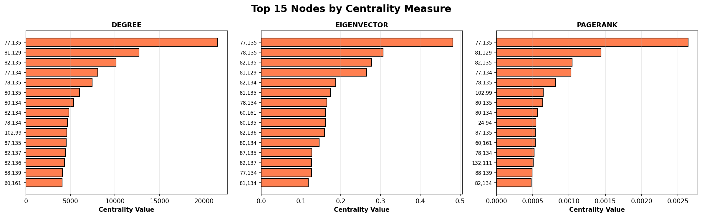
The most intuitive question is: Which locations are most important?
I computed this three different ways, each revealing different aspects of importance.
Degree Centrality simply counts traffic volume. It answers: “Which node has the most commute activity?” The overwhelming winner is node (77, 135)—Nagoya’s the central business district—with over 21,500 units of commute flow. This isn’t surprising; it’s the magnet pulling workers from across the region.
Eigenvector Centrality is more subtle. It recognizes that not all connections are equal. A node is important if it connects to other important nodes. Imagine two transit hubs with equal traffic volume: one connects to peripheral neighborhoods, the other connects to other major business districts. The second one is arguably more important to the overall system because it’s in the backbone of the network.
For Nagoya, eigenvector centrality again ranked node (77, 135) at the top with a score of 0.482, validating its role as the central hub. But this algorithm also revealed secondary hubs—places that are important because they connect to other important places, not just because they have high traffic.
PageRank (yes, the algorithm that powers Google) works by thinking about flow as a process: imagine commuters randomly following corridors through the network. Which nodes would they visit most often? Nodes that receive flow from high-traffic sources get higher PageRank. This reveals nodes that are important within the commute flow process itself, not just structurally central.
Together, these three measures paint a picture: the city has a clear hierarchy. The the central business district is dominant, secondary nodes support the main hub, and the periphery consists of neighborhoods that feed the center.
Most nodes have low scores, but a few have extremely high scores—the signature of a hub-and-spoke urban structure. The single the central business district node dominates all three measures, validating its role as the primary employment magnet.
Community Detection: Discovering Natural Neighborhoods
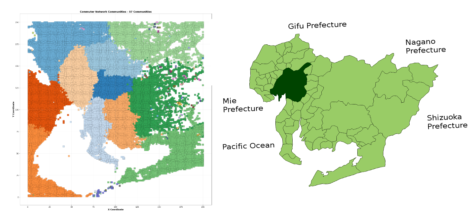
The next question is: Does the network have structure? Are there natural groupings of neighborhoods that commute internally before connecting to broader networks?
I used the Louvain algorithm, one of the most effective community detection methods. It works by repeatedly asking: “If I move this node from its current group to a neighboring group, does the network become more internally cohesive?” Over many iterations, neighborhoods naturally sort into communities.
The algorithm discovered 57 communities in the commute network. But here’s the striking part: the top 10 communities contain 94.9% of all commuters. The remaining 47 communities are tiny—often just 2-6 isolated nodes on the periphery.
The figure above shows these major commuting zones, each colored distinctly. Looking at this map, you can immediately see where the area naturally divides into semi-independent commute sheds. This tells us that despite being one integrated metropolitan area, the city actually functions as a collection of 10 semi-independent zones. Someone in Community 1 is far more likely to work within Community 1 than to commute to Community 2. This finding has real implications: each zone could be partially self-sufficient in employment, suggesting where to invest in local job creation versus regional transit.
Corridor Analysis: Finding the Bottlenecks
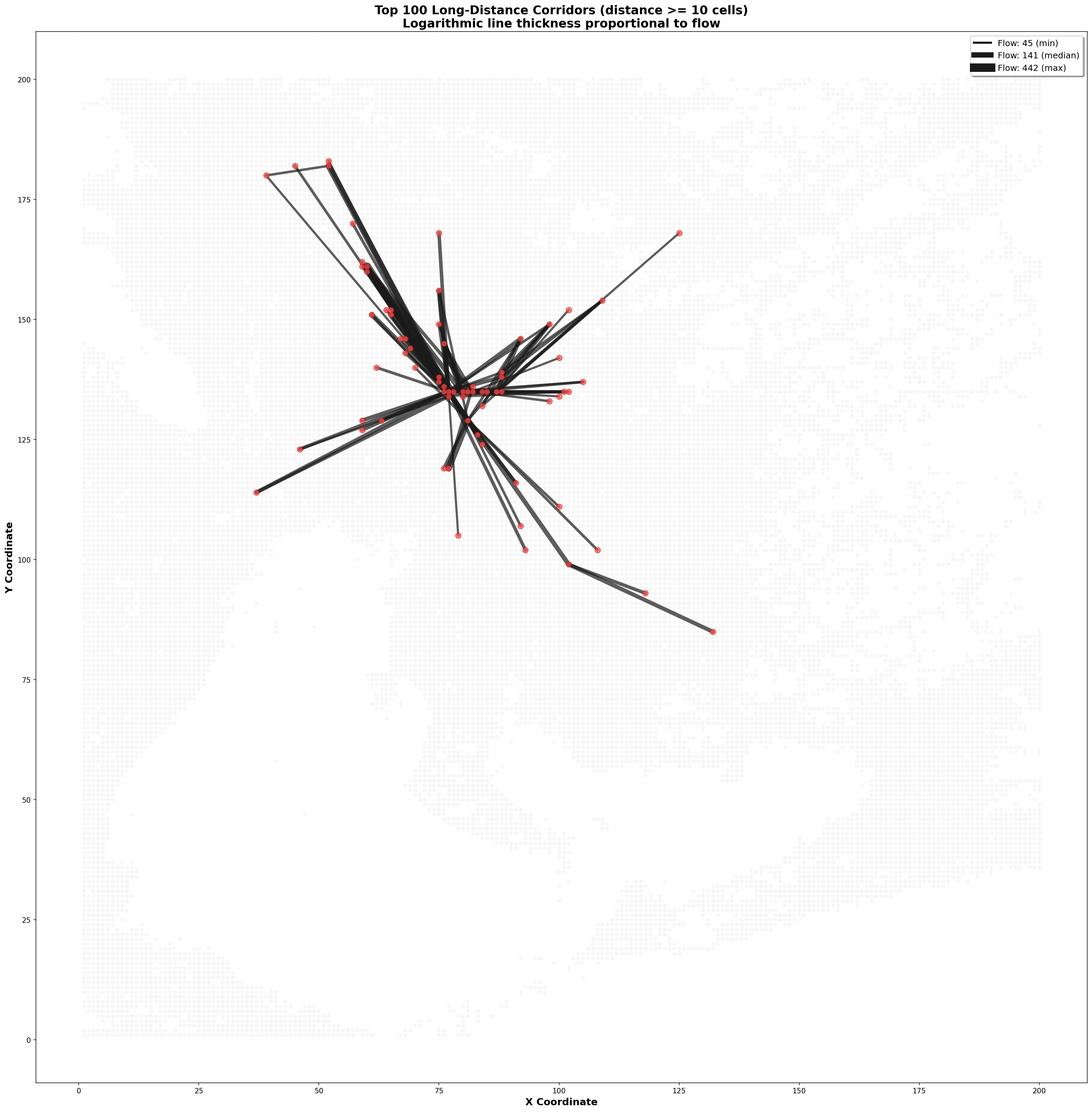
If communities tell us about regional structure, corridor analysis tells us about the critical links.
I analyzed the top 100 long-distance commute corridors (routes spanning at least 10 cells). The findings revealed a classic pattern: power-law distribution.
The single busiest long-distance corridor, from neighborhood (60,161) to the the central business district at (77,135), carries 442 commuters. The second busiest carries 199. The tenth busiest carries 92. By the time you get to the 20th corridor, you’re down to 83 commuters.
Why does this matter? Infrastructure planning. If you’re a city planner with a fixed budget for improving commute corridors, you should focus on those top 68, not spread resources across all 683,461 corridors. Every dollar spent improving the (60,161) → (77,135) corridor benefits 442 people daily. Spending it on a low-flow corridor might benefit only a handful.
The longest corridor I identified spans 53 grid cells, connecting a distant residential area directly to the the central business district. This is a classic pattern in sprawling cities: as residential areas expand outward, some commuters accept very long commutes to reach employment centers rather than moving closer. These long-distance corridors deserve special attention because they’re likely to be the most congested relative to their capacity.
Connectivity and Resilience: Is the Network Robust?
The final algorithmic question concerns robustness: If a major corridor or hub fails, can commuters find alternative routes?
I measured this using clustering coefficients. A clustering coefficient measures how many “triangles” exist in the network—three nodes where A connects to B, B connects to C, and A also connects to C. High clustering means lots of alternative routes; low clustering means corridors are more like highways with few off-ramps.
Nagoya’s clustering coefficient is very low (0.000446). This means the network is highly hierarchical and hub-dependent. There aren’t many alternative routes. If you disrupt the the central business district or major corridors leading to it, many commuters have no alternative path.
This is actually typical of transportation networks. They’re not meant to be highly redundant (that would be inefficient and expensive). But it does suggest vulnerabilities. A transit disruption in one of the major corridors could strand thousands of commuters with no obvious alternative.
Conclusion: Reading the City’s Structure
Every city has underlying structure—concentrated employment, dispersed housing, funnel-like commute flows. But most cities don’t have fine-grained data making this structure visible.
The LYMOB dataset, combined with network algorithms, reveals what residents experience but can’t quantify. It transforms millions of individual decisions (where to work, where to live, how to get there) into a coherent mathematical structure that shows how cities actually function.
What’s remarkable is how well the mathematics maps to human reality. The hubs we identified match known employment centers. The communities we detected match actual geographic and social boundaries. The power-law distribution matches what traffic engineers observe every day.
By building a mathematical model of commute flows and applying network algorithms, we can answer questions that matter: Which areas are most critical? Where are bottlenecks? Which corridors would benefit most from capacity improvements? Which neighborhoods could absorb more employment to reduce commute pressure?
The tools exist. The data exists. What remains is applying these insights to create more equitable, efficient, and resilient urban systems.
Appendix: Geographic Discovery - How We Identified Nagoya
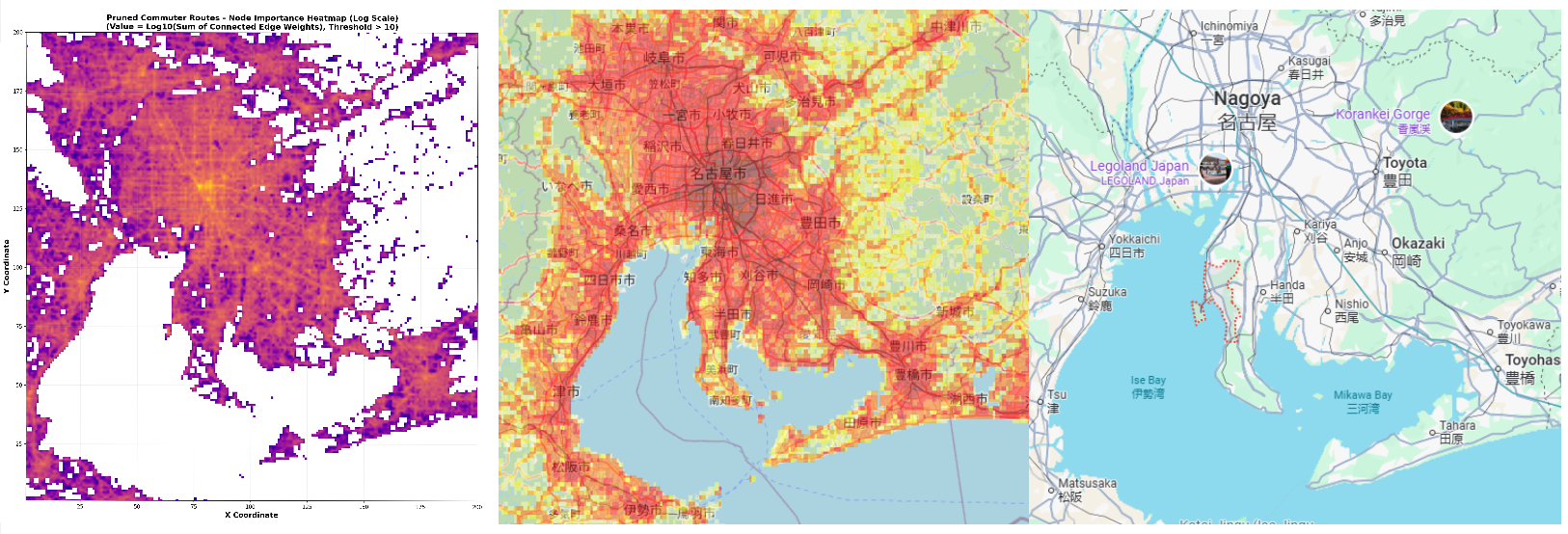 (left) cityA in the LYMOB dataset (middle) ORNL Landscan Population layer (right) Google Maps of Nagoya region in Japan.
The LYMOB dataset does not disclose that the data represents the Nagoya region. The dataset we looked at is simply called “cityA” - this was done intentionally to increase privacy in the data.
During initial exploration of the data, I noticed that the flow of the cityA data had a rather unique shape. Particularly it featured a double bay and a circular gap, which I assumed was a river feeding the bay. I cross-referenced this pattern against Japan’s coastline and determined that the area was in fact Nagoya, but it was rotated. When I mapped the coordinate system as X = Longitude, Y = Latitude , the grid coordinates aligned perfectly with the actual layout on a real map.
This discovery is the first that I could find that uncovered a true location in the LYMOB dataset.
Network Summary:
- Nodes: 23,090 geographic cells
- Edges: 683,461 commute corridors
- Total trips: 1.6 million bidirectional commutes
- Connected components: 46 (largest contains 99.5% of nodes)
- Detected communities: 57 (top 10 contain 94.9% of commuters)